Wycombe Wanderers and Hummel are entering the third year of their partnership, with the second batch of new kits coming this season, following two years with the previous kit.
The Chairboys opted to switch from Irish manufacturer O’Neills in 2023, who served the club since 2016. The move to the Danish kit makers was an instant success, with Hummel producing three instant classics in the 2023-25 home, away, and third kit.
The new kits are expected to serve from 2025 all the way through to 2027, if Wycombe continue the trend of changing strip every two years as they have done in seasons gone by.
The reaction to the new kits were mixed, with a clear winner when it came to which one of the three was the best looking.
After releasing some very sleek training kits, the expectations were high for Hummel to deliver one of the greatest Wycombe kits of all time, but most supporters were left feeling slightly underwhelmed with the final product.
So, for TheQuartermen’s first opinion piece on our brand new website, we thought we’d share our honest thoughts on each of the three new kits.
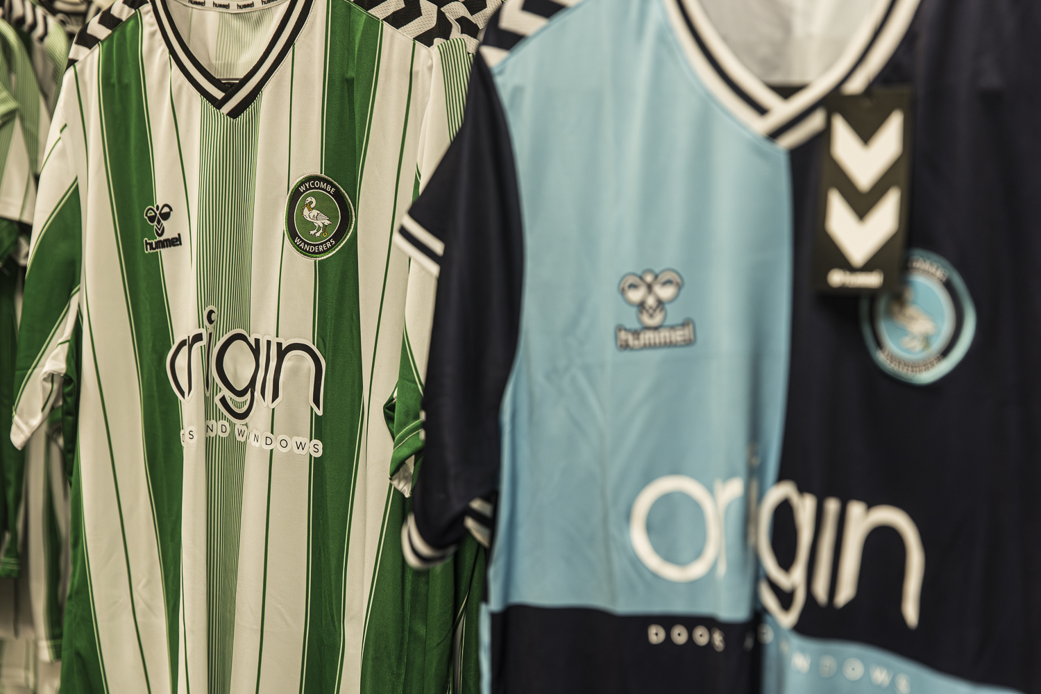
Home Shirt
When it was first revealed, this shirt left many stunned, but not in a good way.
It’s difficult to do much with a quartered shirt, especially with how much of the club’s identity is based around this design, but what Hummel have done isn’t the answer.
We’ll start with what’s good – the shade of both blues they’ve used is far better than the previous kit. The 2023/25 shirt is a stunner, but the light blue has always seemed slightly off, which maybe stopped an 8/10 from being higher.
The main talking point is the pattern on the kit being slightly confusing. From some angles, it looks too busy, and maybe doesn’t work very well with a quartered shirt .
The full dark blue sleeves will take some getting used to, as Wanderers have usually had opted for one light blue, and the other dark blue.
Having sat with it for a while, it’s started to grow on many people, including us, and our rating was certainly higher after the dust settled.
It’s not the worst home kit Wycombe have ever had, but it’s far from a classic – 4/10
Away Shirt
We mentioned a clear favourite from the three, and it was the away shirt that took the majority of the plaudits.
As an away strip, it does the job. A lovely shade of yellow accompanied by a dark blue that compliment each other really nicely.
Something that didn’t show up initially was the much-loved Swan pattern from the training shirts making an appearance on the kit in a different shade of yellow.
This is a nice addition from Hummel, as it certainly adds more of a Wycombe feel to this strip, instantly squashing some claims of it being “Too Mansfield Town.”
The bucket hat with the design on is also a thing of beauty, and great quality, so kudos to them for making that.
Again, it’s not groundbreaking or the best kit ever made, but there’s no real complaints at this one.
It’s clean, simple, and does the job – 7/10
Third Shirt
Another one that had mixed reviews was the third kit, which is a green and white checkerboard pattern that pays homage to the previous away kit.
The colourway works very nicely, as we’ve already seen with last season’s away strip, with a minty green complimenting the white and black accents nicely.
Again, it’s certainly nothing groundbreaking, but there’s no real holes to pick with it either. It was critiqued as just a ‘lazy template’ design by some, but for the amount it’ll be worn, it makes sense for the third kit to be the simplest.
Overall, this isn’t a bad shirt to say, it’s just a very generic third kit, which will serve the purpose nicely, and puts a nice spin on the quarters, with the checkerboard pattern acting as lots of smaller quarters together to make the design.
All in all – a simple and solid kit – 5/10
Final thoughts
Hummel smashed it out of the park with their excellent training tops, so naturally the expectations were high for the actual playing kits.
However, it’s understandable to see why some were left underwhelmed by what they’ve seen, as there is plenty of room for improvement on two of the kits.
The home shirt will take some getting used to, and it’s always nice for change, but the general feeling is that this was the wrong direction to take the quarters.
The other two kits a solid, and will serve their purpose, whilst adding a nice pop of colour for the club on their travels.
An overall ranking for Hummel’s Wycombe Wanderers playing kits this season would have to be 6/10 – Solid, but not classics.